
Thursday, 30 April 2009
Tuesday, 21 April 2009
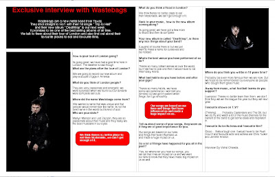
metal hammer research


I analysed the front covers of these two magazines. The Metal Hammer magazine is very eye catching because its got colours which contrast well and which would attract a lot of audiences. also the way the fonts and coverlines have been layed out are also distinctive because it brings something new to front cover. The barcode and magazine price are at the top right and when you see it, it does make you see it straight away because its in a white background and the font size is quite large. what i thought was very nicely done was at the bottom of the front cover where its written "THRASH", it immediately shows its a magazine which would attract certain people who are into metal music.
The other magazine i analysed was Kerrang magazine. it was similar to the metal hammer magazine in terms of fonts images and page layout. In both front covers, the main images cover the title of the magazine. This makes the main image stand out more and make it the centre piece of the front cover. The Kerrang magazine uses colours which don't contrast fully but still make the front cover look effective. The use of yellow, pink and white don't really show effectiveness but the way it has been used in the front cover of this magazine does bring an extra something to the whole concept of the front page.
Both magazines are very distinctive in their own ways and i thought both magazines had similar and different ways of using text and images. i think that the metal hammer magazine used more text then image but the way the text was used with big bold writing made it look much more effective more linked in with how metal music would be. With the Kerrang magazine its half and half with the way the images and texts were used. There isn't more text then images or more images then text. I think they are both the same. But again as i said with the Metal Hammer magazine, they were used very effectively. There were a variety of font sizes and image sizes used in the magazine. Also having small images put on various areas of the front cover made it look professional because when you see music magazines, they have various sizes of images anywhere on the front cover and they have various text sizes and fonts to contradict the images.
Subscribe to:
Comments (Atom)