For my media project I had to create a front cover of a school magazine with a heading and a medium close up photograph of a school pupil. Also for this project I had to design and create a contents page for the school magazine. also my second project was to analyse and design my own music magazine which would follow the codes and conventions of existing magazines. Firstly for my school magazine project, I wanted to design a magazine which would attract a lot of school children but also attract parents of children where they could find out about what was happening in the school like activities, important dates. I think if I did that then my magazine would bring a more wider range of people and make it a much bigger seller to people.
To start my project I researched and analysed school magazines to see what was included in the school magazine. I analysed the “ The Palmer Post “ which is the name of the magazine of Canon Palmer Catholic School and “ High Profile “ which is the name of the magazine of King Edward vi School For Girls. I was looking at the layouts, colours, pictures, fonts, to see how my school magazine can follow the codes and conventions of existing school magazines.
The Palmer Post had a lot of interesting factors which looked unique to others which I researched on the internet. What struck me most was the title at the top, it resembled the colours of the school uniform which the students have to wear and it really stands out well to give that distinctive effect. What else is unique about this is that the layout is tidy and it doesn’t look crowded. With the 2 images below the magazine title beside each other, it makes it look more vivid. The first image is a medium wide shot of a ceremony on the grand opening of a building in the school. Beneath the image is a caption in small letters telling readers what the image is showing us. The second image is medium shot of the school headmaster and the Bishop of Brentwood unveiling a plaque. Again there is a caption beneath the image to tell readers what the image is showing
High Profile also was very eye catching and I was surprised how not much colour made the front cover look eye catching. The background was mainly black with the colours of the clothes the people at the front also standing out. The main title is very striking because its in big white writing with the “High“in normal large letters and the “Profile“ in big bold letters. This would grab attention off anybody as black and white are a very striking combination together. What really grabbed my attention was that there was a boy on the front cover of the magazine even though the magazine belongs to an all girls school.
After analyzing and researching the 2 school magazines, I designed my school front cover on paper first, so it was my first paper draft. I was thinking what image I would have on my front cover and how I would lay out my cover lines and what colours I would use. I was still undecided on whether it would be better to have an image heavy front cover or a text heavy front cover. If I did image heavy then the front cover image would be very outstanding and would be the centre piece of the whole front cover. If I did text heavy then readers would recognise the cover lines first rather then the image. After designing both styles on paper I got feedback from my classmates and the vast majority agreed with having a text heavy front cover. So I designed a few more front covers which were text heavy. Then I coloured them to see which ones were compatible and which ones contrasted well with each other. I decided that having a plain white background with the letters representing the school colours would look very stylish and bring a sense of simplicity to the front cover of the magazine. I thought having large bold letters as the title would easily catch the attention of the reader and make them want to read the magazine. I think that having alliteration in the title would make people memorise what the name of the magazine is called. I decided that having alliteration I would make the outstanding letter bigger and balance the “anon “and the “onnections “with the large “C “letter. Also having the logo on the side and quite a reasonable size would also bring positive feedback from readers. As it’s a school magazine, I thought that having all the cover line titles underlined would make the front look neater and more tidy to look at, I wanted to make it link to how people in school present their work in class.
Now to the image on the front cover. It had to be of a representative of the school so I decided on a student in the sixth form. It had to a medium close up, and I decided to have it on the bottom right as it will attract people as it’s an image of a student and readers themselves would want to know what the image represents in the magazine. Also to add an extra touch is put a caption in front of the image, “New year new beginnings” which represents the student in the image’s first year in sixth form and it’s a message for every person starting new at the school to make a name for themselves here.
The final aspect of the magazine is the sponsors at the bottom of the front page of the magazine. I thought that having sponsors on the front of the magazine would look more professional. When I was researching school magazines, there were a lot of school magazines that had sponsors on their front covers. So I thought that having sponsors on my front cover would make it look more elegant.
Now to the contents page. Again I decided to make it plain and simple. I decided again on doing a plain white background because it wouldn’t interfere with anything and it wouldn’t look complicated. After researching other contents pages, I had a few ideas on how I would have my contents page. I decided on having it as a list and then have the page numbers in bright colours to make it look better and stand out. Having a contents page as list is common and it’s in every magazine you see, so I didn’t really want to do anything different and try and make it look fancy.
After showing my school front cover and contents pages to my peers, I got a positive feedback from them but a few of them said I could do better and there were some aspects which needs improvements. I think myself I can do a bit better because my downfall was my timing. I was spending too much time on something and I really could have improved that. But I think if I was to do this project again I would get a positive feedback from my peers and not have anything to change after showing it to them.
After completing my school magazine my next project was analyzing and designing my own music magazine which had to follow the codes and conventions of existing music magazines.
Firstly I had to research existing magazines and analyse their use of colour, fonts and font sizes, and many aspects regarding codes and conventions of music magazines. I decided to do a music magazine on heavy metal. I decided to do this because it has a very large fan base and I wanted to rise to a challenge I believed I could achieve and do well in. To start my metal magazine, researched existing metal magazines such as metal hammer and kerrang. As soon as I saw the front covers of the magazines, I knew I was in for a very hard time ahead. I saw on the front covers that there are a lot of cover lines and articles, but also there are one maybe two main images on the front covers. So after analyzing I designed a paper draft copy of how I would want my design based on what I saw on the existing metal magazines. I had to decide a lot of things like where on the front cover would I have my image and where I would put my cover lines, also not forgetting the title of my magazine.
The first thing I did was print out the two metal magazines and stuck them on A3 paper. I annotated them and wrote what was good and what needed improvements. After doing that I designed several copies of my paper draft of what I wanted my magazine to look like. I then showed my peers and got their assessment of what design they liked. Then I had to decide what colours I would use keeping in mind I had to make it suitable to make it a metal magazine. I had to decide the colours of the text, image background, and the colours of the cover lines.
After doing all that, I then came to designing my metal music magazine on the computer. As there were limited Mac computers, I decided to use the normal computers and then upload them on the Mac computers later on. So to see how my magazine would look on the computer with colours, I designed it on paint. I had to design a computer draft and I decided that if I do my final design similar to my computer draft then it would save me time and it would look good as they are compared together with similar designs. I decided on having an existing image of a metal band and then work on the cover lines and background colours a bit later. I noticed on a lot of metal magazines they had names of bands on the top and bottom of the front cover page. I thought that would look very good with my magazine and I would have to make it stand out. So I made up metal band names and had a background colour of fire which I thought would give it a deadly look. And in between each band name to give it an extra chilling look, I put thunder shapes there to make it look much better and make it stand out. Then I had to decide on cover lines and think about what font and what size I would use. I wanted to make my fonts to look very eye catching and bring something extra to the front cover to attract readers. I had to make sure that my cover lines didn’t cover the main image. One important factor I had to decide was the name of my music magazine. So I had the image take up the whole page but I didn’t want the face being covered by the cover lines, so I had to make sure that my cover lines where in suitable places on the front cover and it would attract readers. After designing my front cover on paint I converted it to Photoshop and tried to change things in the fonts and colours and try and blend things together to give it a more eye catching look. One important factor I had to decide was the name of my music magazine. I had a range of ideas and shared it with my peers, they thought that “Deep Metal“sounded good and people would know it is a metal magazine because of the name.
The other aspects I had to do were having bar codes, pricing and all the compulsory aspects which are part of the conventions of a music magazine. Also I thought I would add something more then just cover lines to make the front cover stand out. I decided that having a freebie would make the front cover look more professional. To make it stand out, I displayed a “free Thrashbins poster“ in a circle which I thought looked very stylish and seeing those on existing music magazines made me realize that it is good to have and people get attracted to freebies in magazines.
Now to my final front cover. After analyzing existing cover lines and annotating them, also designing my own paper drafts of my front cover, I had to think a lot about how people would find my final front cover and also would it follow the codes and conventions of existing magazines? I firstly wanted to focus on my front cover image would be. I wanted to have a person dressed as a gothic character and give a pose people wouldn’t be fond of. I took a picture of a suitable candidate and had them pose in different positions and see what image suited my front cover best. I had to make sure it was a medium close up and that it wasn’t too light or too dark. When putting everything together, I was quite surprised with the outcome. It looked better then I imagined. The front cover image and the cover lines to the left and having a little circle showing the freebie, looked really outstanding in my opinion. Also the title and the fire effect at the top and bottom of the front cover gave it that little extra spice. When everything regarding the front cover was completed, I thought it looked very good. I would say my hard work paid off and I think I have made a magazine that would attract a huge number of people and stay a firm fans favourite for a very long time.
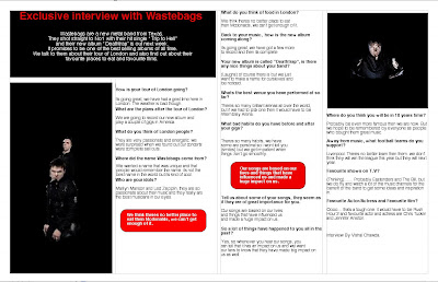
Now to my double page spread article. It took me quite a while to decide what I should do. There were a range of ideas which could do for my double page spread. But the most common ones I saw were interview pages, so I thought that after analyzing interview pages, I would get to know how to do them. Firstly like I did with my magazine first draft, I designed a paper draft of how I would layout my double page spread. I had to make it look very professional and also I had to make it very eye catching and appealing to the audience. After discussing it with my peers, I decided to design the version my peers liked. So to start this section, I designed my double page spread on apple works. It wasn’t until I first used it to see how easy it is to use and how a lot can be done in such little effort. I firstly thought of questions based on who I was interviewing and what suitable questions they would find interesting. I decided to do a fictional interview with “ Wastebags” so I took pictures of two guys who were doing a photoshoot In London So I took pictures of them. Then came the background colour and the font colour of my double page spread. To avoid having to rub your eyes with bright colours, I decided to have the double page spread the same colour as my magazine front page, black and red. I decided this because it would contrast well with the magazine front page and plus the double page spread would look very elegant because it would have images on the pages with interviews and captions. Then the most important thing was the main title of the interview page, I had to decide what colours I would use as the writing and also to make it look much better I had to have sentences below the title to introduce what the interview was going to be about and I thought it would look much better. Also there were other things to consider with my double page spread, I had to decide how the page layout would be and also I had to make sure I had the right amount of questions and not have a lot which would not really be relevant. It did take a while to think of the questions and answers for the interview.
From this project, I have learnt a lot about the world of media and how challenging it can be. This project has taught me that time is very important and also quick thinking is essential. When I was deciding what colours and images and fonts to use, I did spend a bit too much time on deciding those and I probably would have got more done in a more longer amount of time. Also in terms of my project, I think I did quite well with the images and researching of how I wanted my magazine to look. I thought it would be better to compare a large variety of music magazines rather then certain genres and magazines which are similar. Another aspect about this project is that there were not many computers for everyone to use. For this project, we could all use apple mac computers but there were not enough for everyone. For my project, I had to use a standard computer and use other programs to do my work on. but what is good is that for my double page spread I used the apple mac using the apple works program which was very good to use and it wasn’t that hard to use.
I hope to improve my project soon as I don’t think I put in enough time into the whole thing. I really believe that I used up a lot of time on certain areas of my magazine. As I mentioned before, it took me a while to decide the colours, font and images of my magazine and it’s something I have to work on. Also again as I mentioned before, having more apple mac computers would have been better so that my project would have taken less time to complete and use the latest programs to make magazines look really professional. I think that if I was to do a similar project to this, I would create a magazine which would appeal to everyone and create a wider target audience. But I think that my current project would get me a reasonable grade.
My media project challenges conventions in a number of ways. Firstly my magazine is a metal music magazine which has big audiences worldwide and the metal music industry is rapidly growing every year to bring more and more success to the music world. In my magazine. I have used common aspects of metal genres like the use of colours and images. I used red as it represents things like death and love, and I have used black which represents deep and meaningful. Also with the images, I used a suitable candidate who would fit into the type of genre I was doing and I wanted them to look as if they were unknown. So I wanted them to be wearing sunglasses and have a hoodie to make them look more like a fugitive and bring something extra to the image and what people would say about it.
My media product represents different social groups through the use of words I have used in my coverlines and also the image. With the coverlines, I used a lot which would be inappropriate to use for young kids. The image as I mentioned before is mainly understandable to young adults who know what certain words mean and what certain images represent to others. But also I have messed about with a few words to just play about with what bands call themselves today. The name “Waste bags “just came in my head and I liked it and I thought it was very funny and that people would find it funny as well.
In terms of what my media product consists of, I would say that existing magazine company Metal Hammer would distribute my media product. To start my project I researched metal magazines and the ones that struck me most were metal hammer and kerrang magazine. After looking at the metal hammer magazine, I thought that if I did a similar magazine front cover to that and also to kerrangs then it would look much better as I have put together 2 magazine ideas and put them into one front cover. So after analyzing my front cover and the metal hammer front covers, I think that metal hammer would distribute my magazine front cover.
The audience for my media product would be young adults, mainly people above the age of 16. I say this because I have used some aspects of my magazine to make it look as if adults only would read this magazine. Some of the aspects as I mentioned before include, the use of some words in my coverlines and the images. But also its for men and women so its not going to be a magazine which only attracts a certain gender.
I attracted my audience in a number of ways. When I was designing my magazine, I was frequently asking for feedback from my peers and I thought by doing that I would be aware of things I was doing right and doing wrong. If I did the whole project and then asked for feedback from my peers then it would take time to improve my mistakes and have positive feedback from then on.
My media project challenges conventions in a number of ways. Firstly my magazine is a metal music magazine which has big audiences worldwide and the metal music industry is rapidly growing every year to bring more and more success to the music world. In my magazine. I have used common aspects of metal genres like the use of colours and images. I used red as it represents things like death and love, and I have used black which represents deep and meaningful. Also with the images, I used a suitable candidate who would fit into the type of genre I was doing and I wanted them to look as if they were unknown. So I wanted them to be wearing sunglasses and have a hoodie to make them look more like a fugitive and bring something extra to the image and what people would say about it.
My media product represents different social groups through the use of words I have used in my coverlines and also the image. With the coverlines, I used a lot which would be inappropriate to use for young kids. The image as I mentioned before is mainly understandable to young adults who know what certain words mean and what certain images represent to others. But also I have messed about with a few words to just play about with what bands call themselves today. The name “Waste bags “just came in my head and I liked it and I thought it was very funny and that people would find it funny as well.
In terms of what my media product consists of, I would say that existing magazine company Metal Hammer would distribute my media product. To start my project I researched metal magazines and the ones that struck me most were metal hammer and kerrang magazine. After looking at the metal hammer magazine, I thought that if I did a similar magazine front cover to that and also to kerrangs then it would look much better as I have put together 2 magazine ideas and put them into one front cover. So after analyzing my front cover and the metal hammer front covers, I think that metal hammer would distribute my magazine front cover.
The audience for my media product would be young adults, mainly people above the age of 16. I say this because I have used some aspects of my magazine to make it look as if adults only would read this magazine. Some of the aspects as I mentioned before include, the use of some words in my coverlines and the images. But also it’s for men and women so its not going to be a magazine which only attracts a certain gender.
I attracted my audience in a number of ways. When I was designing my magazine, I was frequently asking for feedback from my peers and I thought by doing that I would be aware of things I was doing right and doing wrong. If I did the whole project and then asked for feedback from my peers then it would take time to improve my mistakes and have positive feedback from then on.
Looking back on this task, it has been very hard to do. I have learnt so much in these past few months about time keeping, making sure I don’t waste time on one thing and that I do everything in order rather then do the small things first then the big things last. I have also learnt that planning is an essential part of media and having a plan and sticking to it is one of the most important aspects of media studies. You always have to know what you are doing and making sure that you have everything you need to complete your project. But I would I say really enjoyed designing my school and music magazines. It gave me a chance to see how the professionals do it and how much time and effort goes into making magazines.
Monday, 11 May 2009


Thursday, 30 April 2009

Tuesday, 21 April 2009
metal hammer research


I analysed the front covers of these two magazines. The Metal Hammer magazine is very eye catching because its got colours which contrast well and which would attract a lot of audiences. also the way the fonts and coverlines have been layed out are also distinctive because it brings something new to front cover. The barcode and magazine price are at the top right and when you see it, it does make you see it straight away because its in a white background and the font size is quite large. what i thought was very nicely done was at the bottom of the front cover where its written "THRASH", it immediately shows its a magazine which would attract certain people who are into metal music.
The other magazine i analysed was Kerrang magazine. it was similar to the metal hammer magazine in terms of fonts images and page layout. In both front covers, the main images cover the title of the magazine. This makes the main image stand out more and make it the centre piece of the front cover. The Kerrang magazine uses colours which don't contrast fully but still make the front cover look effective. The use of yellow, pink and white don't really show effectiveness but the way it has been used in the front cover of this magazine does bring an extra something to the whole concept of the front page.
Both magazines are very distinctive in their own ways and i thought both magazines had similar and different ways of using text and images. i think that the metal hammer magazine used more text then image but the way the text was used with big bold writing made it look much more effective more linked in with how metal music would be. With the Kerrang magazine its half and half with the way the images and texts were used. There isn't more text then images or more images then text. I think they are both the same. But again as i said with the Metal Hammer magazine, they were used very effectively. There were a variety of font sizes and image sizes used in the magazine. Also having small images put on various areas of the front cover made it look professional because when you see music magazines, they have various sizes of images anywhere on the front cover and they have various text sizes and fonts to contradict the images.
Subscribe to:
Posts (Atom)